DataStax - UX
Project Overview
Revamped the DataStax.com blog interface, transforming blog detail pages into cornerstone content and integrating a new Q&A post format to drive SEO value.
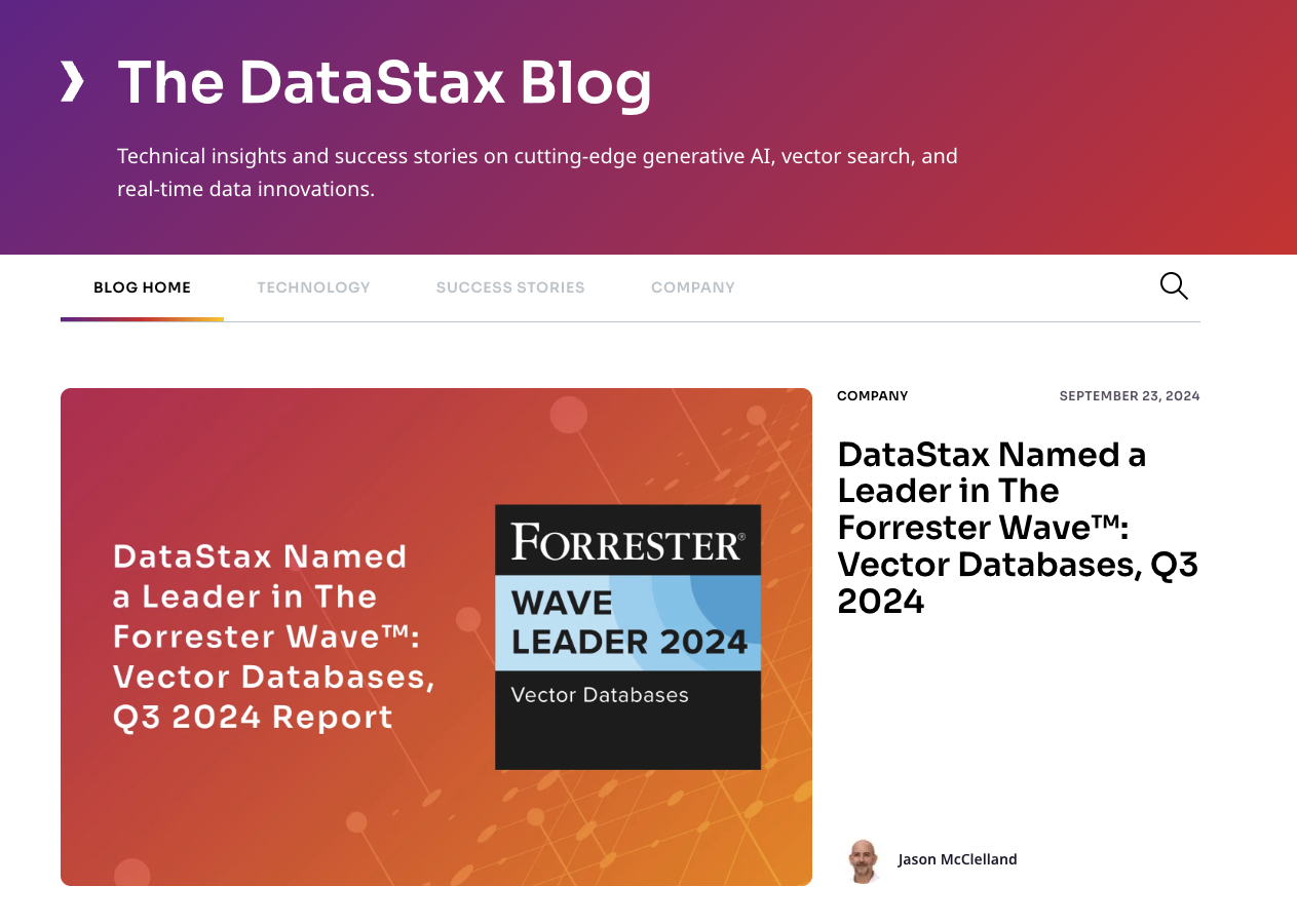
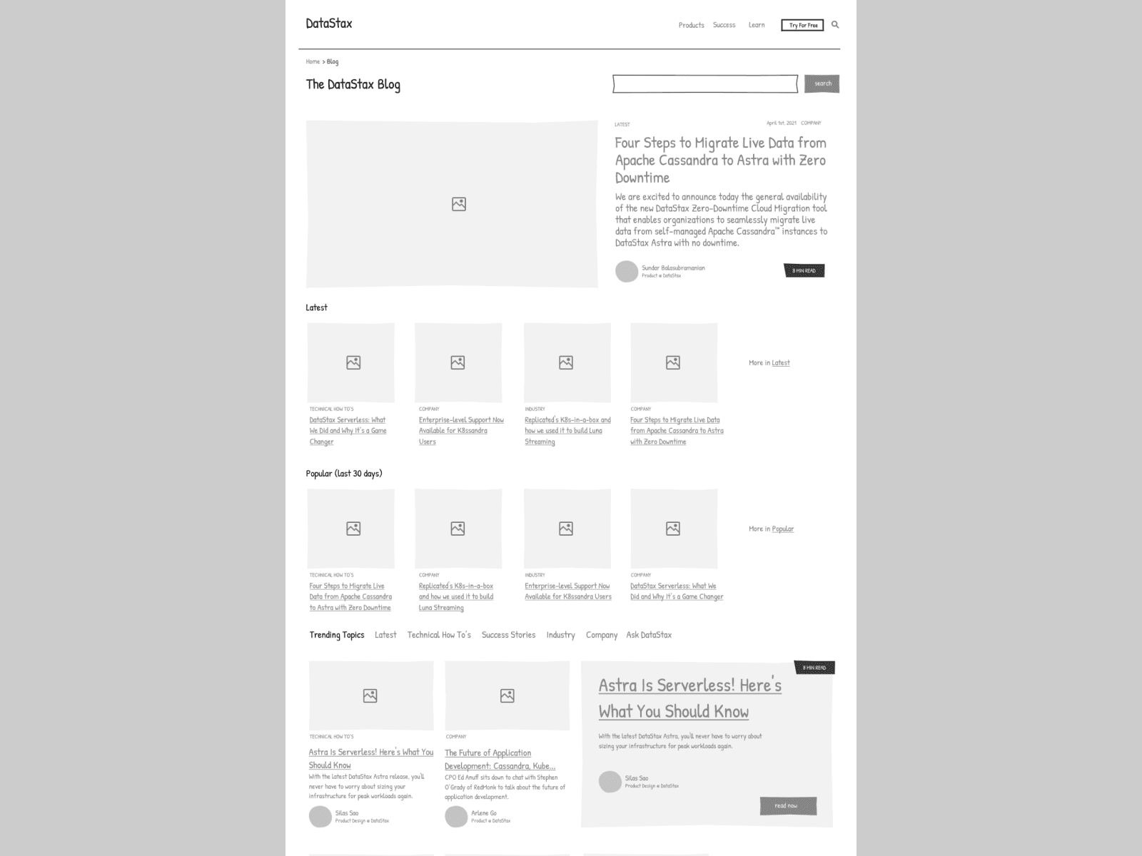
Blog Homepage - Top
This screenshot shows the top section of the DataStax blog homepage, spotlighting the featured article "Astra is Serverless! Here's What You Should Know". It sets the stage for in-depth content that anchors the site's knowledge base.
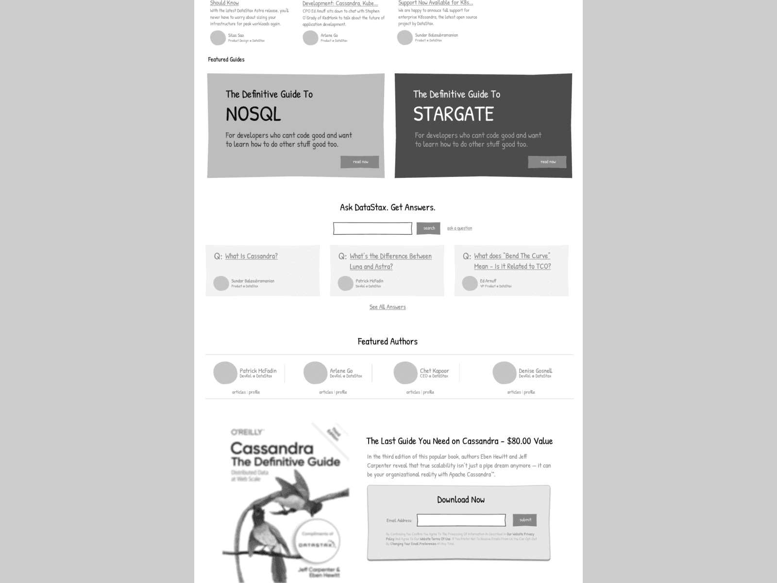
Blog Homepage - Bottom
The bottom section of the blog showcases related offers, featured guides, and notable authors, encouraging continued interaction and positioning the blog as an authority in the space.
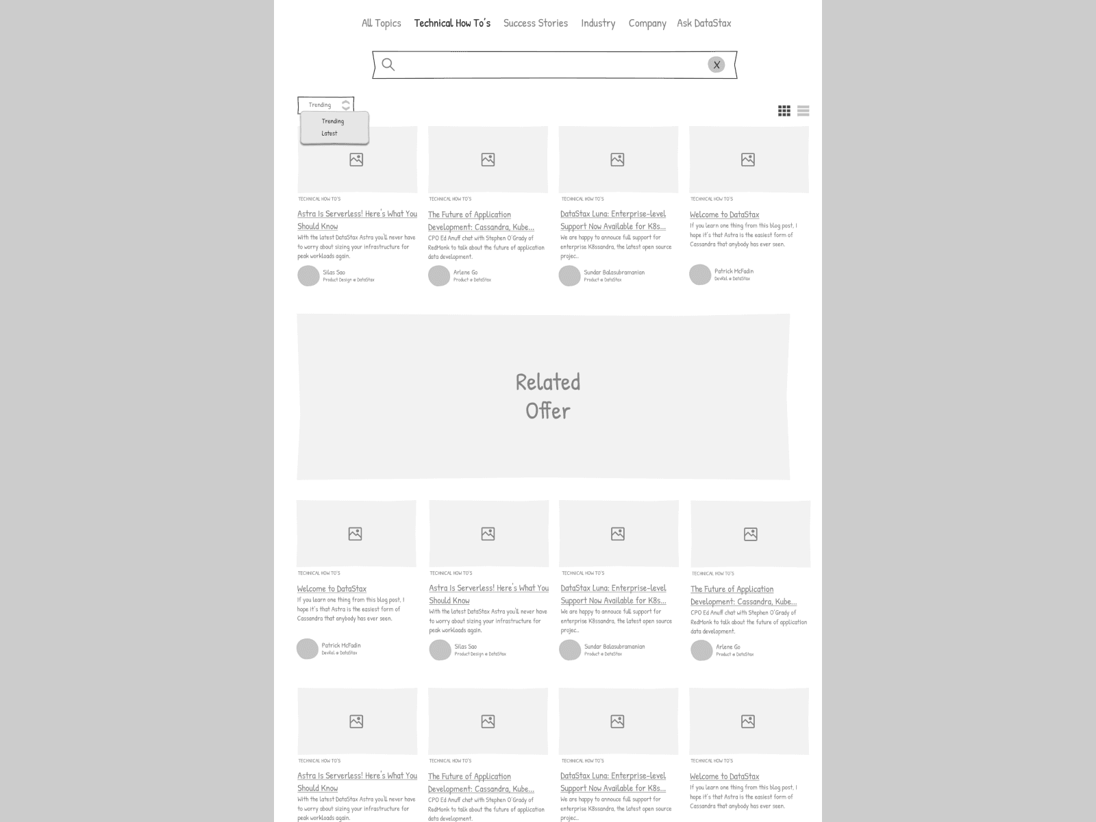
Blog Homepage - Navigation
This part of the blog allows users to search and navigate through trending topics, latest articles, and popular content, reinforcing the blog's role as a resource hub.

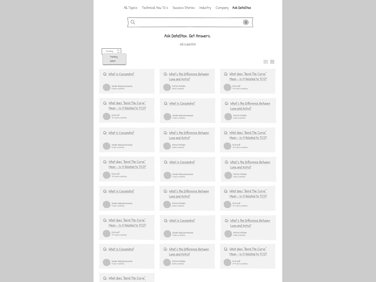
Blog Q&A Landing Page
This is a dedicated landing page for the Q&A section, a strategic addition designed to boost organic search performance by addressing common queries related to Cassandra and other DataStax topics.
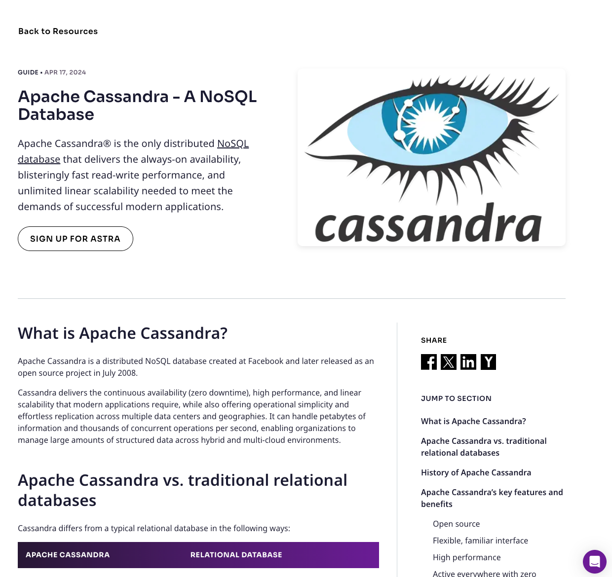
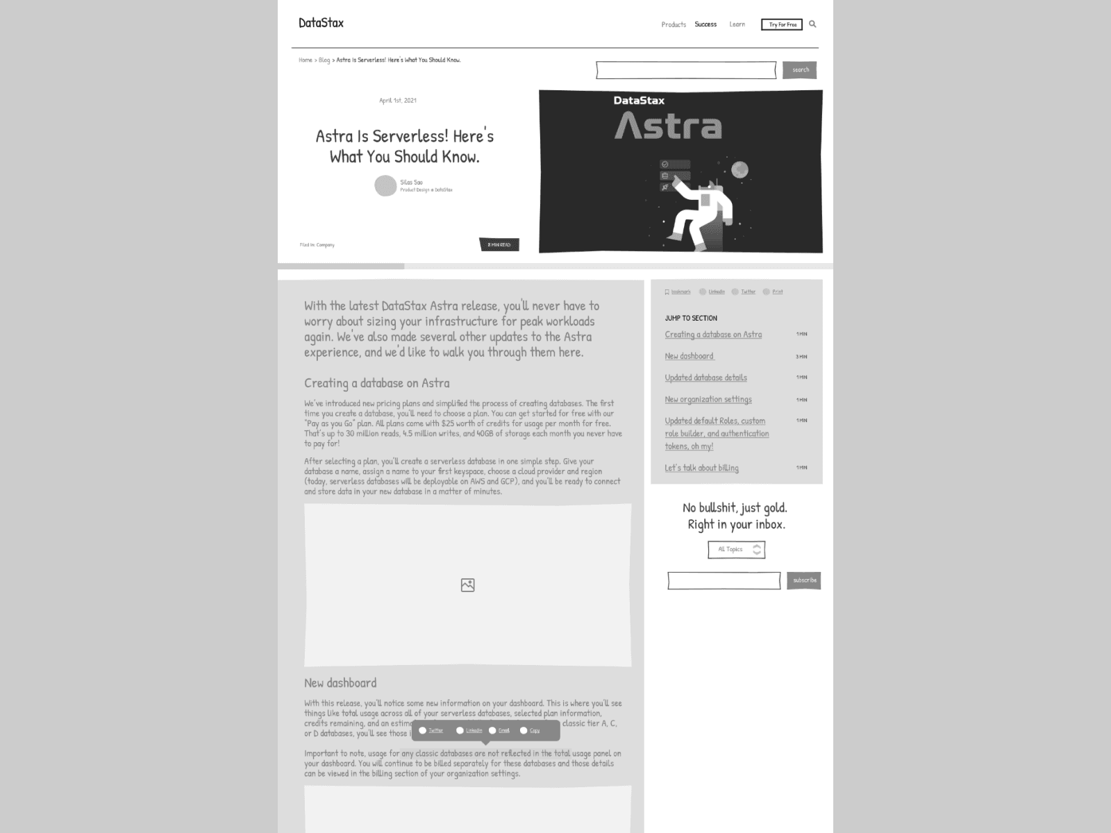
Blog Detail Page
Featured here is a blog detail page that highlights an individual post. This design layout is intended to keep readers engaged with the content, providing a seamless reading experience and encouraging deeper exploration of the site.
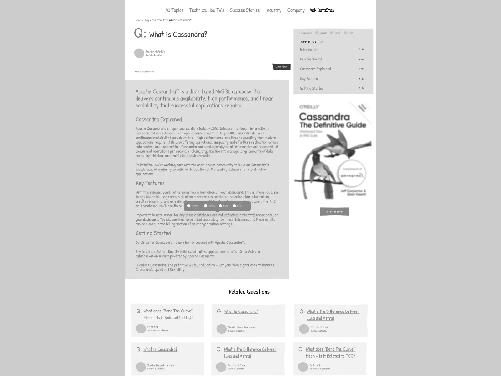
Blog Q&A Detail
Here's a closer look at a specific Q&A entry. This format aims to directly answer user questions, improving the site's relevancy for specific search queries and thus, its SEO footprint.
