Shotgun Spread - Framer UX
Introduction
What follows are samples of work I did to bring Shotgun Spread to life.
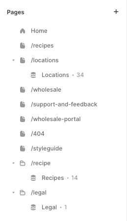
Page Hierarchy Overview
The site's structure is crafted for intuitive navigation, guiding visitors from the welcoming home page through to the key sections like recipes and locations, as well as vital pages for wholesale inquiries, support, and feedback. A dedicated 404 page and a comprehensive style guide round out the framework, all crafted to ensure that visitors effortlessly find what they're searching for.
Framer CMS Setup
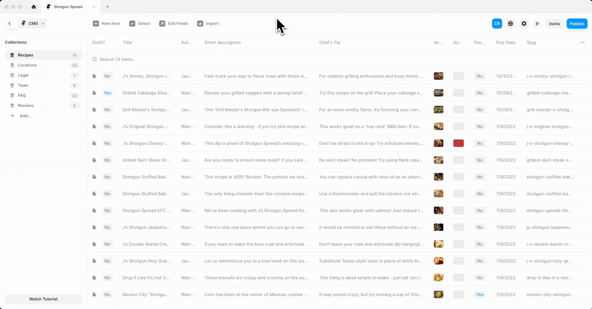
Within the Framer platform, I've elevated recipes and locations, acknowledging their significance for our culinary-centric audience. Framer's "Collections" feature—though the name is a bit off the mark—enables the swift curation and updating of content, ensuring visitors access the latest offerings and information seamlessly. This efficient content management system empowers the team to maintain a vibrant and current website with ease.
Responsive Layout
Framer has transformed the management of our responsive website into a smooth and potent process. I've engineered layouts that gracefully adapt to various devices, confirming that content is always displayed in its best light, whether on a desktop, tablet, or smartphone. The flexibility Framer provides in fine-tuning responsiveness allows us to deliver a consistently excellent user experience across all screen sizes.

301 Setup
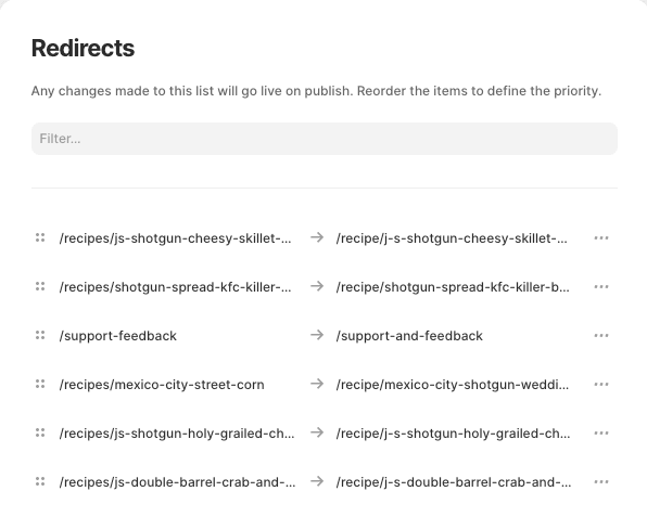
Transitioning from a WordPress foundation required a strategic setup of 301 redirects to preserve our SEO standing and ensure a smooth user transition. Framer's redirect tool proved instrumental in mapping old URLs to their new destinations, guaranteeing that both users and search engines find their way without a hitch. This meticulous arrangement of redirects is managed with precision, preserving link functionality and relevance.
Database setup
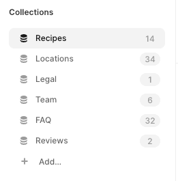
The database is built from scratch, harnessing Framer's "Collections" for a no-code approach to curate content groups like Recipes, Locations, Legal, Team, FAQ, and Reviews. These Collections form the content backbone, neatly organized and poised for data integration, ready to be showcased through the user interface.
Mapping database to the UI
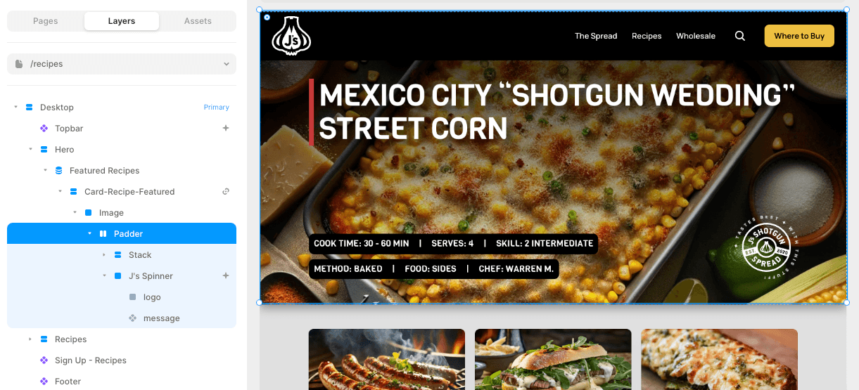
I've integrated the UI with Framer's CMS, ensuring that the interface dynamically reflects the latest product details and descriptions straight from the database. This direct connection between UI and database keeps the content fresh, consistent, and easy to update, mirroring the data's real-time evolution.
Defining interactions
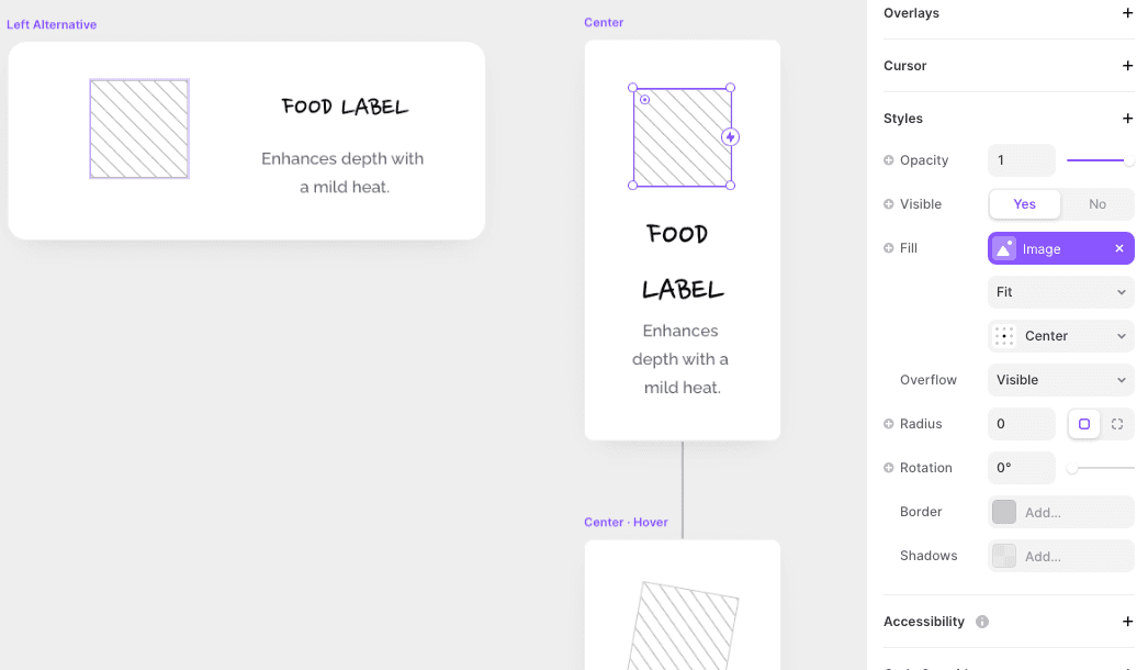
Utilizing Framer's interactive design capabilities, I've tailored the mobile UI to respond intuitively to user input. The interface is crafted to provide a seamless experience, with transitions and modals that unfold in direct response to the user's actions, making for an engaging and natural interaction.

Page properties
I've designed a page to not just present delectable recipes, but to also illustrate the versatility of our condiment. It's a space crafted to invite discovery and interaction, allowing users to explore and experiment with the product's diverse culinary uses.
Version control
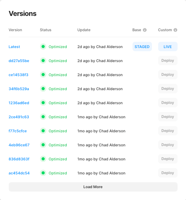
Leveraging Framer's version control has been essential in documenting the evolution of the project. It allows for fearless experimentation and iterative updates, ensuring that no progress is lost. This feature is critical for structuring my workflow, enabling smooth updates, and making the design process both effective and dependable.
