Shotgun Spread - UI
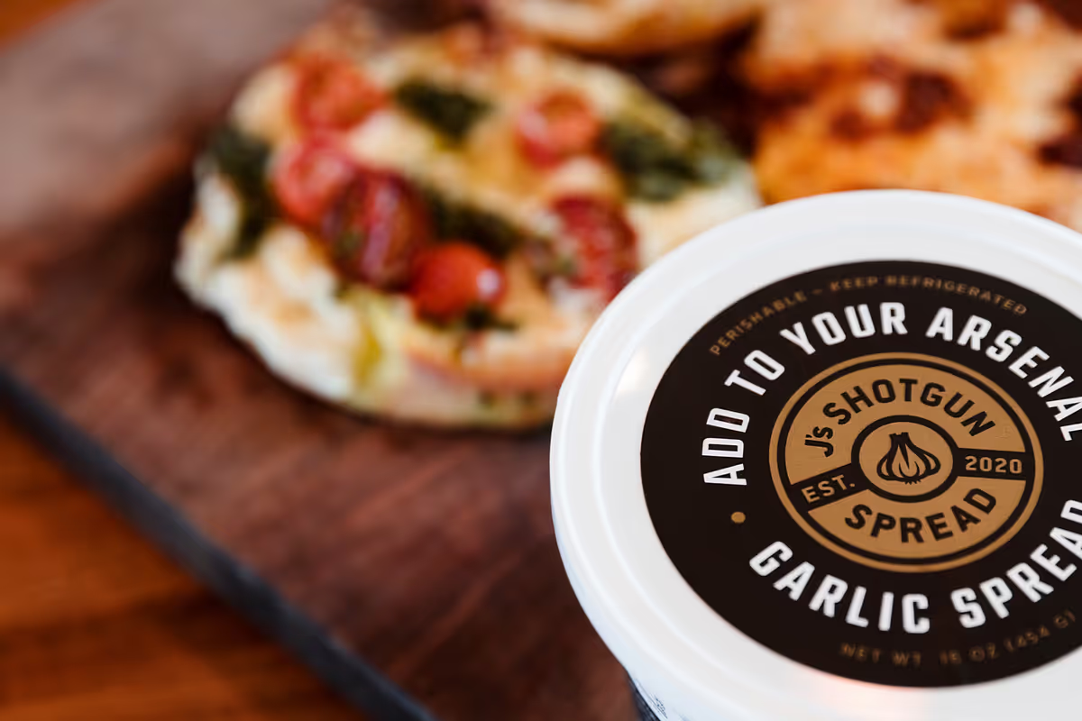
Background
When I set out to build shotgunspread.com, I had a clear goal: create a space online that’s as welcoming and vibrant as J's Shotgun Spread itself. The site serves as a window into a culinary adventure that's gaining traction in Northern California.
I dedicated myself to crafting a site design with as much care as goes into every jar of J's Shotgun Spread. The result? A website that’s direct, quick, and engaging, pulling visitors into the narrative.
What I've created is more than a webpage—it’s a destination for food enthusiasts and professionals to discover their next kitchen staple. It's where top-notch cooking meets standout design. The site is a complete sensory journey, mirroring the adventure you find in cooking with J’s Shotgun Spread.
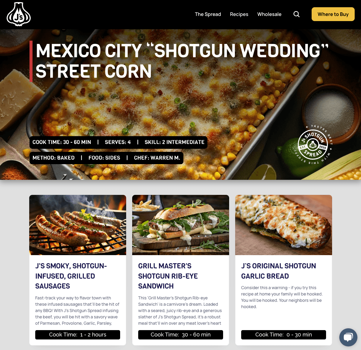
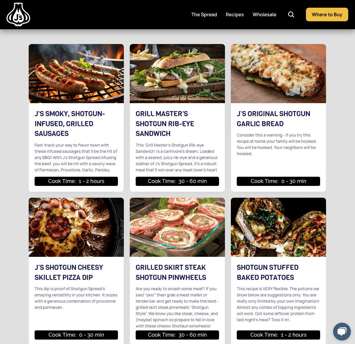
Recipe Landing Page and Grid
Knowing how versatile Shotgun Spread is, I made sure the recipe section was front and center. It's all about how you can use Shotgun Spread to whip up something amazing.
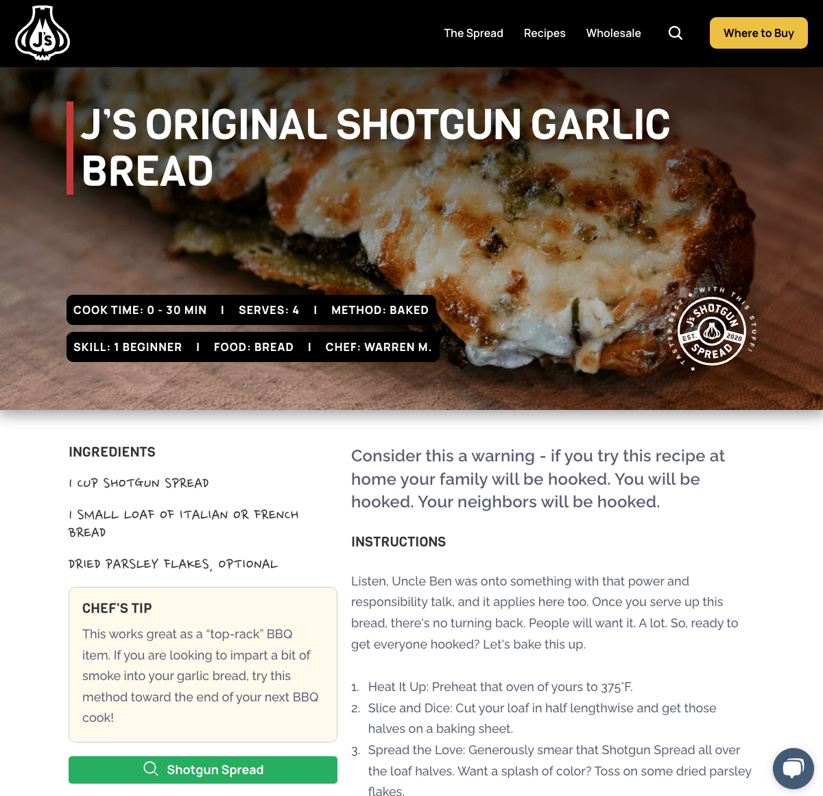
Recipe Page
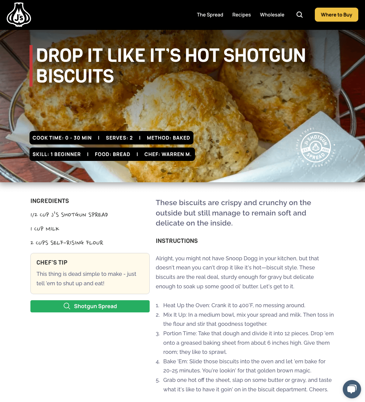
This is one of the two designs I came up with for the recipe details. It's got everything you need right up top: cook time, servings, method, difficulty, type of dish, and who came up with it. And the recipe itself? That's the main event, right there in the body of the page.
Recipe Header
I had a bit of fun with the logo — it zooms in with a little bounce to make sure you know Shotgun Spread is what makes these recipes special.

Another Recipe Page
Just like it says, here's another layout that puts Shotgun Spread front and center in the recipe. The animation naturally draws the user's eye.
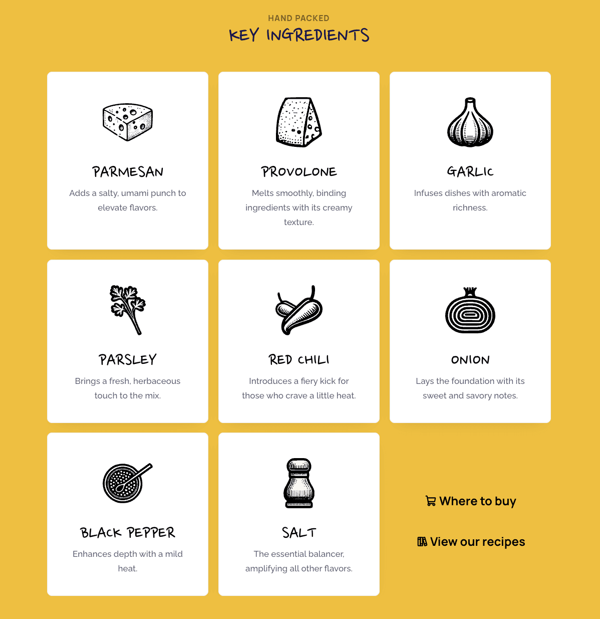
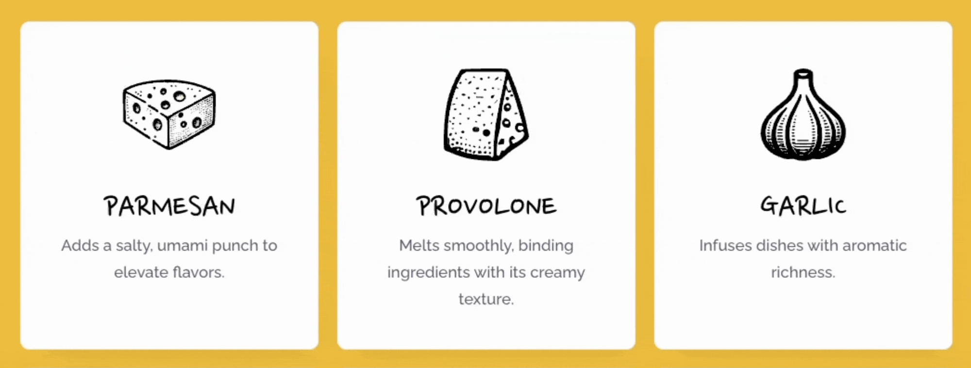
Key Ingredients Grid
This grid shows off the main ingredients you'll find in Shotgun Spread. I used some AI magic to draw these up and get them looking sharp and consistent.
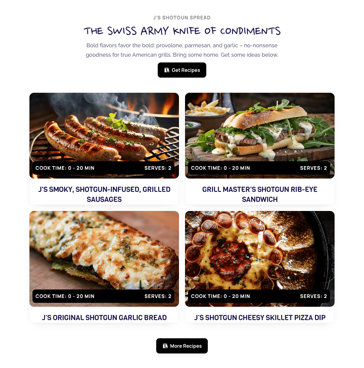
More Recipes
Down at the bottom of each recipe, I added some links so you can easily hop to other great recipes that use Shotgun Spread.
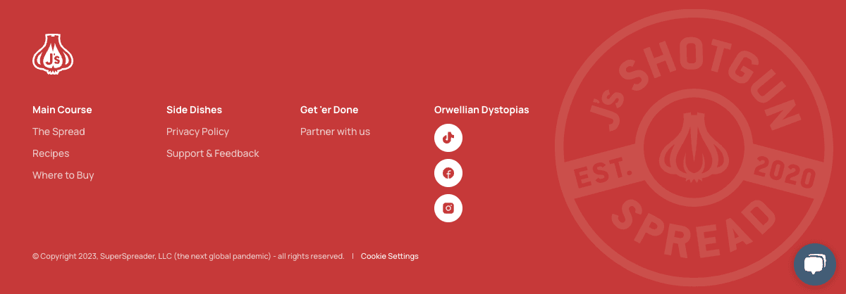
Footer Design
I decided the bottom of the page needed a burst of color, so I went with red. It stands out and ties in with the colors you often see on food labels and branding.
Subtle Interactions
And just for a bit of fun, the illustrations give a little twist when you hover over them. It's a small thing, but it makes the site feel alive.
Check out the full Shotgun Spread UX and interactive build at Shotgun Spread UX and Framer Build
